The subject of backgrounds on Etsy has always been a bit of a two-sided battle; Team 'all white background' versus Team 'interesting'. Since the removal of the front page treasury the ubiquitous white background seems to have lost it's edge. While there are many shops that can and do benefit from a plain white background, I find shops that sell creative, unique often one of a kind items to need something more. In fact the more unique and OOAK your stuff is, the more I recommend having an individual background.
Your images represent your work and your shop when they're out and about online; if someone sees your Etsy listing on Pinterest, your images need to say to them 'I have stuff you love'. The internet is a highly visual place and most people do their shopping by wandering around social media. The more appealing to your target market you can make your backgrounds, the more you will generate traffic.
In this post I'm going to talk about 4 main kinds of background - light, dark, patterned and colour. Light ones will make your shop look fresh and airy, dark ones will give you drama, patterns will give you an opulent mood and colour will give you vibrancy.
In order to pick the best background for your product, you have to first do what I'm always telling you to do- know your market! Figure out who's most likely to buy your goods and market them accordingly. Even if your jewelery doesn't look particularly 'of a style', you can still make it so by using backgrounds - in some cases your background can talk more about your shop style than your jewelry can.
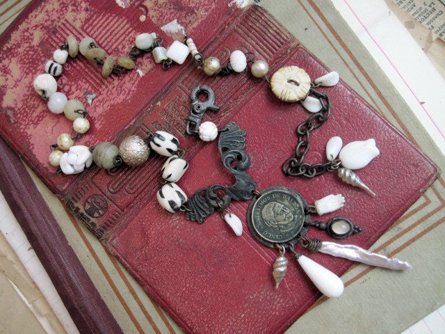
Here's a pair of simple earrings I made in a pretty straight forward design. They don't have an especially unique style going for them and they are given no favours with the plain white background. Now then- if I shoot them on something romantic like old paper, they suddenly change:
A warmth comes into them. The earrings haven't changed, but there's a noticeably more attractive quality about them. Watch what happens the more romantic layering I use...
As the background layers built up the earrings took on a complex personality - a whole world is hinted at; it's as if they been cast aside by a reclusive spinster in an attic full of papers. By the time we get to that last image, these earrings might as well be in the arms of Mr.Darcy for all their romantic saturation. With this deep layering of fluff and ruffles, I can shoot almost anything and it'll look romantic.
See?
So now you see that it's very important your background matches your aesthetic because it will affect your product and your overall shop style. In fact sitting all together on your Etsy storefront, your listing images will do more for your brand's visual presence than anything else.
OK, let's talk pale backgrounds. A couple of you commented that you shoot your product on plain white backgrounds and it's become boring- not surprising! You can use a pale background and still have your shop look lovely and non-boring, and the key to this is texture.
Texture is what makes things interesting. A white sheet of office paper is boring because it has no depth - it's a flat white nothing. But a sheet of artist's watercolour paper is more interesting because the uneven surface reflects the light in a more natural way. White on white is often used to create a fresh, clean look- just be sure to use 'warm' whites; ones that are more creamy, boney colours to avoid a cold feeling.
If you like the look of white on white but don't want your shop looking too bright, you can add some darker browns in there. Stick with a neutral palette when using white-on-white; colour will take you in a whole other direction which we'll talk about in a bit.
In the picture above I have the same stack of papers as shown in the
image before, but I've added a dark brown underneath. This has given an
earthiness to the image and toned down the 'bright summer's day'
feeling while still keeping the clean feel.
Now, depending on what you're shooting, white backgrounds can be tricky. Colour generally does well against a white background, no matter how bright it is, but if you sell something that's dark, the white background is going to prevent you from showing good product details. If you sell something that's pale, shooting on a white background is going to bleach our your product. For artistic and blog shots it's fine, but given that items on Etsy are represented in such small images, we need that first image to pop.
In the pic above, the item is starting to get 'lost' in the white on white theme. It's not a terrible photo, just a bit boring. In the picture below the background is slightly darker than the item, thereby making it 'pop' out of the image and become more noticeable.
Also, by adding texture to the picture we've created a more dynamic image- because the buttons are small I kept the texture to the side so as not to crowd them out- we'll talk about that more later.
Okay- now let's talk about
Dark backgrounds. These are often avoided due to their low-light nature, but looking around on Etsy you'll see a lot of shops successfully using the dark background. Up until recently changing my look, I used a dark background well (if I do say so myself). Other good shops with a dark background include
Now Vintage and
obsequies. The main benefit of a dark background is drama and the key to making it work is having the right light and good tonal variation.
Tonal variation is a natural part of the world around us. Look at a
blackbird, or a
black orchid- they're not exactly black, there are patches of brown, grey, purple or blue because of the way the light reflects on the surface. So you want to replicate that using backgrounds that are in some way natural, faded or worn down. Chalkboard, slate and worn book covers are all good sources of dark backgrounds.
Dark backgrounds will make bright things such as sterling silver jewelry or white lace look dramatic and give your shop a gothic or elegant noir edge. The best use of dark backgrounds I think is to help black things show their detail- if you've ever tried shooting dark or black patterned items, you know how frustrating it can be to capture that detail. Using a dark background might seem like a bad idea- being that they're both dark they'd fade into each other. But like white-on-white, dark on dark works good too.

The key to a good dark on dark is lighting- you want some reflected light from your item to highlight pattern and form. When shooting dark on dark your best friend is deep and low angles. (As above.) Straight bird's eye can work on some things, but generally speaking low angles are better. Low angles are also good for small things, it adds an intimacy that people relate to. You don't want people ordering from you like you're a medical supplies catalogue, you want them to desire your work! They must have it!
just as shooting white on white needs a darker background than the object, dark on dark needs the opposite. the background should be lighter than the object, so that your item looks deep and rich.
Of course, you might have a few things that are black and you need to show detail, but you don't want your shop taken up with darkness. This is where layering comes in- just like adding the dark brown background under the white stack above gave us a mellowness, layering your black under a paler background will lighten the mood.
In the pic above I stacked white pages up and topped them with an antique ring box, which has a nice distressed finish and a brown tin plate to soften the jump between black and white. It doesn't make the picture too dark but it enables the detail in the buttons to be shown. When you do this make sure you use things that are no brighter than rich cream, and try to have light dark and midtones in there, again to soften the jump.
Here's an example of dark on dark not working- the lace relies on being transparent to show it's beauty, and the dark book board underneath isn't showing us that. Below is the solution- a scrap of light paper has been placed under the lace, allowing the linework to show through. If you want to keep a dramatic look to the image, allow as little of the light page in the frame as you can. Here the layers of darker opulent textures and pattern keep the image feeling rich.
Okay- now I want to move on to patterned backgrounds. Patterned backgrounds can be tricky as they tend to become the overwhelming element in an image, so many people advise against them. Personally though I think they're fine, providing they're subdued; ideally the pattern will be sparse and faded, more of a hint of pattern than an actual obvious design. Texture often counts as pattern as well, if it's rich enough.
Here I've got a selection of my patterned backgrounds. (You can see the details of what's what in my
Flickr.) You'll notice a beautifully patterned end paper there- but wait a second... that's bold isn't it? Didn't I just say no boldness? Yes I did, but of course, like most rules, this one can be bent! Provided your item is bolder than the pattern, you can use it with no trouble.
In the image above, the background used is a photo album cover that's become shredded with age - it's intense texture makes a great pattern. But it's so highly textured that the earrings are lost in the pattern- great for an artist shot, but hardly making them stand out as a product.
Above you can see that the shredded silk has been put to better use with a pale and rather large item instead. The pattern/texture is still a part of the shot, but isn't overwhelming things. The general rule you is you must be careful that your background isn't more fabulous than your product (and it's getting dangerously close above!). Think of it like a wedding- you want everything to be beautiful, but the brightest star is the bride. Your item is the bride.
If you have a pattern that you really want to use but you're worried it's overpowering things, you can use it as a layer in a stack like the one below (on the right).

On the left you have a necklace straight onto the pattern- it's looking a bit cluttered. By adding the blank page underneath and keeping the pattern just as a border, the necklace stands out more. This is a great way of adding that shabby cluttered look to your shop that pattern will give without losing the showcasing properties. below the detail of the earrings is showcased by having a plain background under them, but the image remains opulent due to the pattern and texture around it.
One other thing- small things can get lost on pattern, so it's a good idea to encase them in something. I often use a tiny dish or tray- it keeps the opulence of a patterned shot but makes a lot of tiny things essentially into one large thing.
So if you have a patterned background you want to use, experiment with it! One of my favourite shops with a patterned background is
pinkgrapefruit - she manages to blend bright pattern and vintage objects together that make for delicious photos.
BirdSongStudio does a good job too- her background is faded and doesn't detract from her supplies- in fact it enhances them, which is your background's main job.
Let's talk briefly about colour on colour- that is a coloured item on coloured background. You need to pay a bit more attention here, because the colours you use will have an impact on the item.
I've only just started investigating colour and already I can see what a huge difference it makes. But I've also quickly learned that the right colour is crucial to representing the item in it's best light.
Here's there's a riot of colour! the earrings are coloured, the backgrounds are all kinds of crazy rainbow- it's too much. For this to be a showcase of the earrings it needs to tone down.

Above you can see the earrings are now showcased well- they're on a pale (contrasting) background which makes their dark colours stand out, and the yellow and red either side echo the colours in the beads.
Above, the camera is angled so the red board isn't seen, and the yellow is bringing the gold tones forward.
In the image below, the red board is dominant, and the earrings appear more rich and deep.It might seem pedantic but it's a nice little tip that will help you 'see' what's the best background for your item.
So you can see from this mamoth post that there are lots of things to think about, and just choosing one background is going to be very tricky. Well good! You should mix around and change things depending on what it is you're shooting. Not only to best showcase your item, but for interest's sake. Using 3 -5 different backgrounds will 'break up' the monotony of your shop front and keep things interesting. You can see in my shop that I have largely the same backdrop, but I've changed around the stack and made some pages more dominant in some shots. This makes things cohesive and interesting at the same time.

So- in the next couple of days I want you to wander around your house/studio and find a bunch of things you might like to use for backgrounds. keep in mind your target market and shop's brand image; choose light, dark, and patterned things. (And colour too if you're this way inclined.) Don't just look at book pages, think about trays, picture frame backs, the tops of old boxes, textile pieces, linoleum offcuts, wallpaper, etc. Spend time arranging them against each other (remember the bridal theory) and take some photos- things look different in camera so don't trust your observing eye to see all.

When you've found the backgrounds you like, take an item of yours and try shooting it against them. If you have a blog it would be really great to blog it- it helps pass the knowledge along, and don't forget to give me a link so I can come along and give you any extra advice you might need. If you don't have a blog or you'd prefer a more private approach, feel free to email me from this blog's address (see my profile) and I'll help out.
Yes, it's going to take time to get this right, and time is something precious to many of us. But we all know quality takes time and practice makes perfect. There really is no cheating on this stuff. Well actually learning all this from me is kind of cheating! I'm happy to pass on what I know, and I've learned a few things myself just from doing this. It's taken me over a week to compile all this, but the driving force is to help you become better photographers and online merchants.
Questions? Ranting? Excuses? Drop them in a comment- I'll follow you up as best I can.
The next photography post will come when it happens, probably in the next 2 weeks. As to what it will be about, I don't know yet! (Suggestions welcomed.) In the meantime I'm working on a quick 'how to' regarding fake vintage supplies; there's a ton of 'vintage' out there and it's often frustrating to me the things that are listed as vintage but aren't, because I like to know the pieces in my work really are vintage if I say they are. I have a few tips and tricks to sniff out the chalk from the cheese which I'd like to pass on to you. Man you get some great free info from me, huh? You lucky things.
note- all the images here were virtually unedited- just resizing and auto levels. I wanted this post to be about the backgrounds, not sexy photography! And yes it was hard not to tinker with them- my inner perfectionist is in a terrible mood now!

 Well- I was going to inform everyone that I had a few more textile kits up in the shop...


